Client's Goal
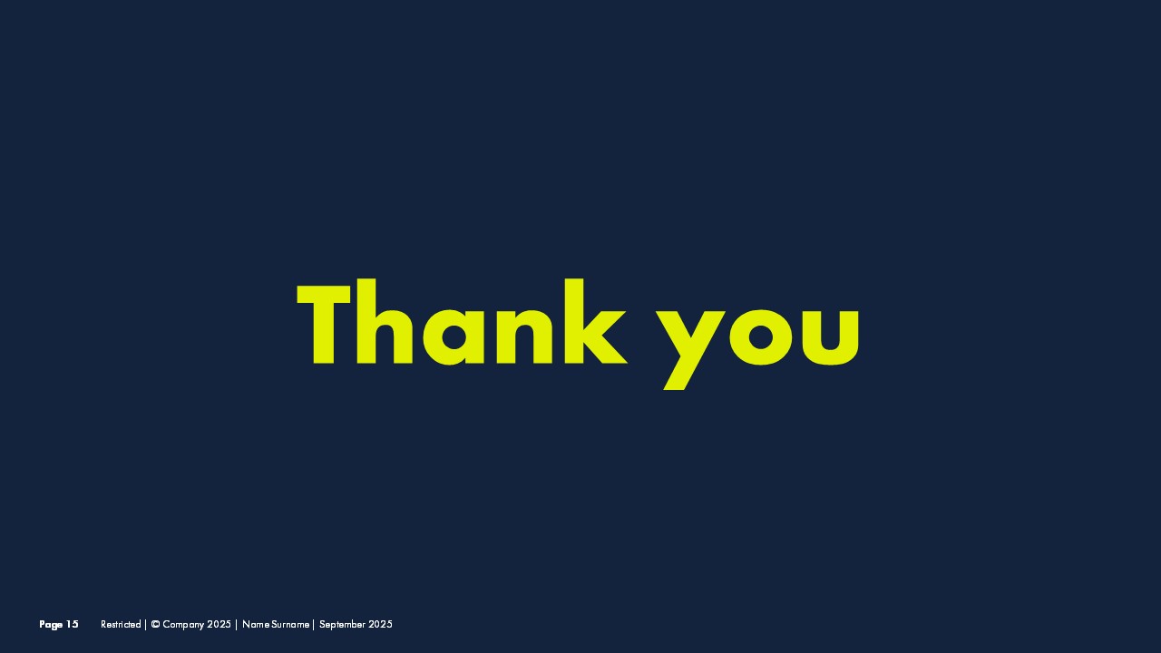
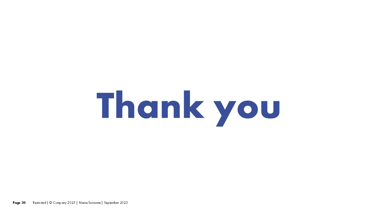
Modernize an outdated corporate presentation while maintaining brand recognition. The client needed a fresh look that would resonate with younger stakeholders without alienating existing partners. An additional requirement was flexibility: the deck needed to work in both formal and high-impact settings, which led to the decision to develop two complementary versions.
Our Approach
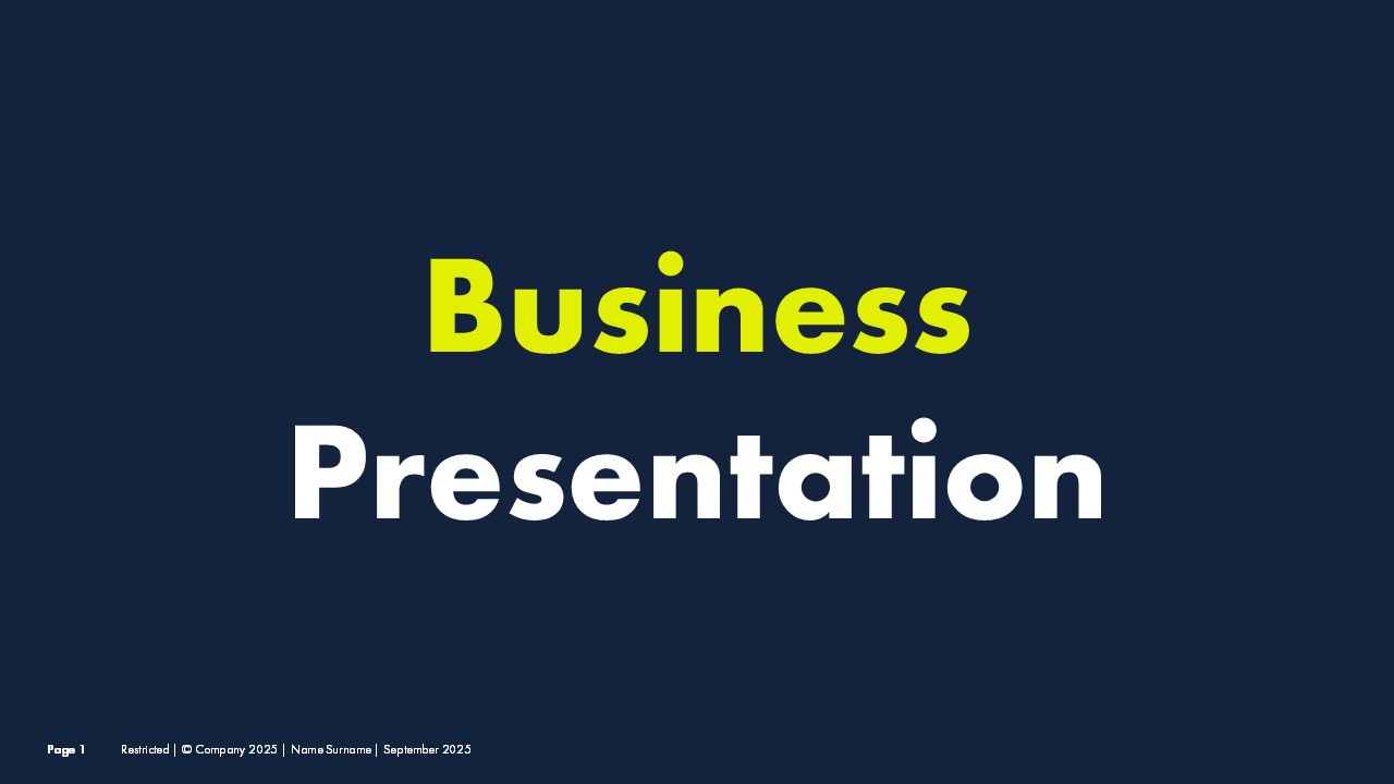
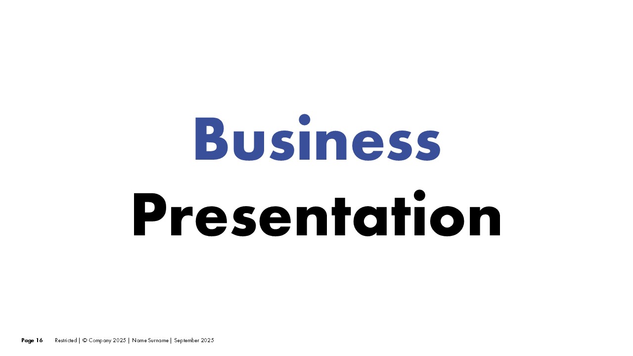
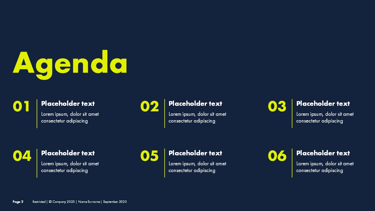
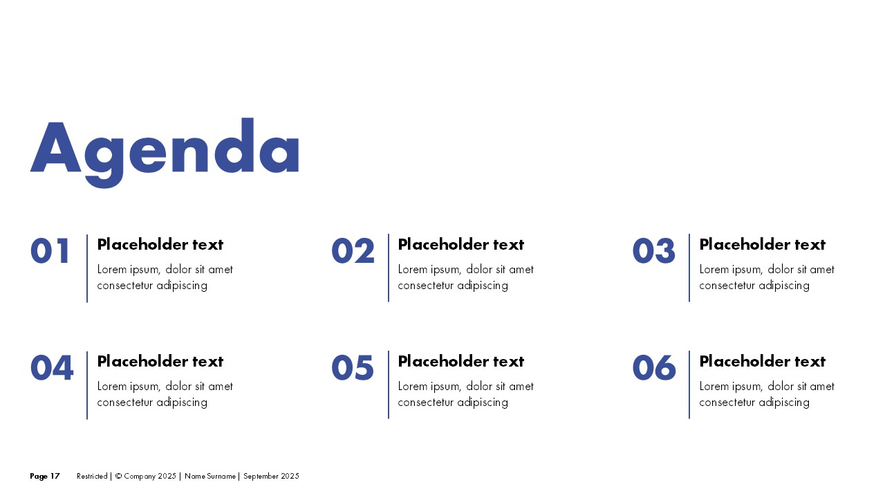
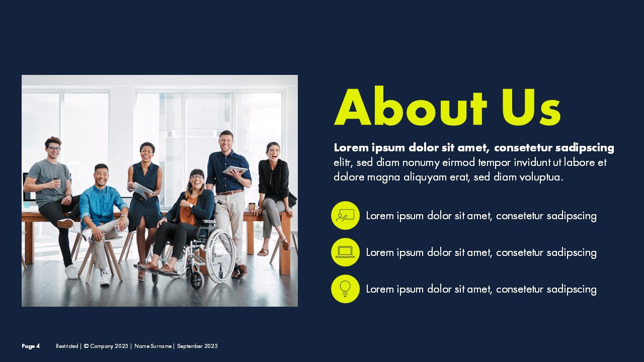
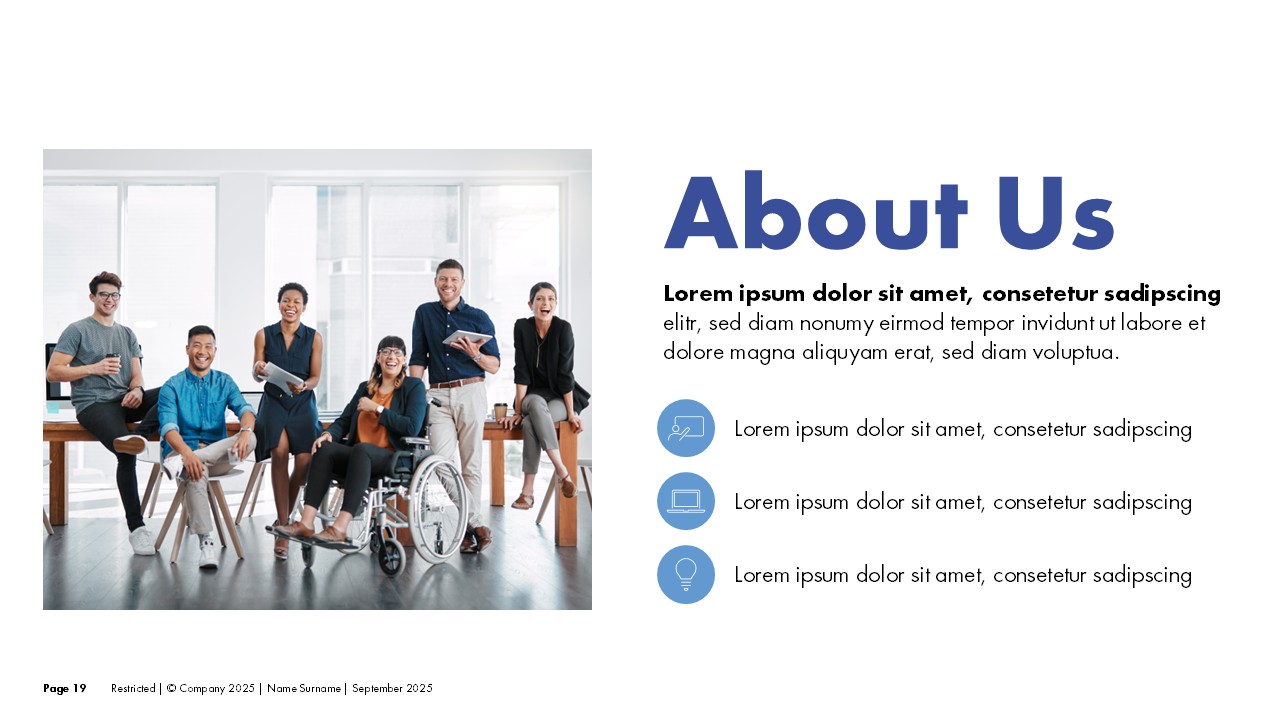
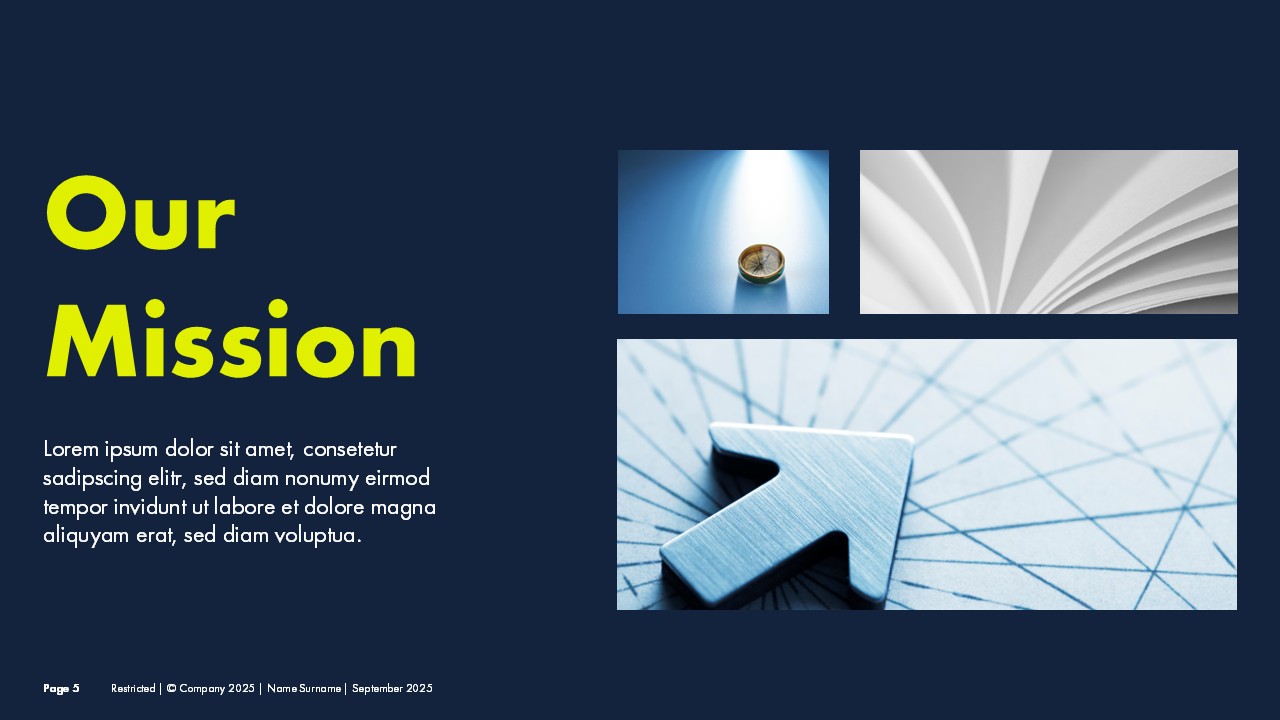
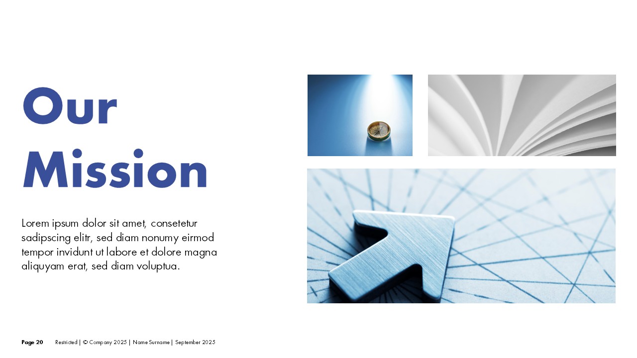
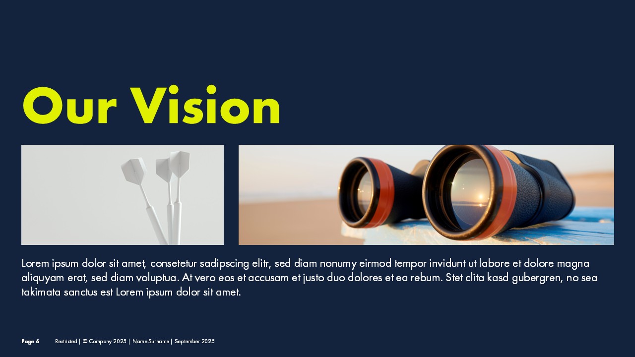
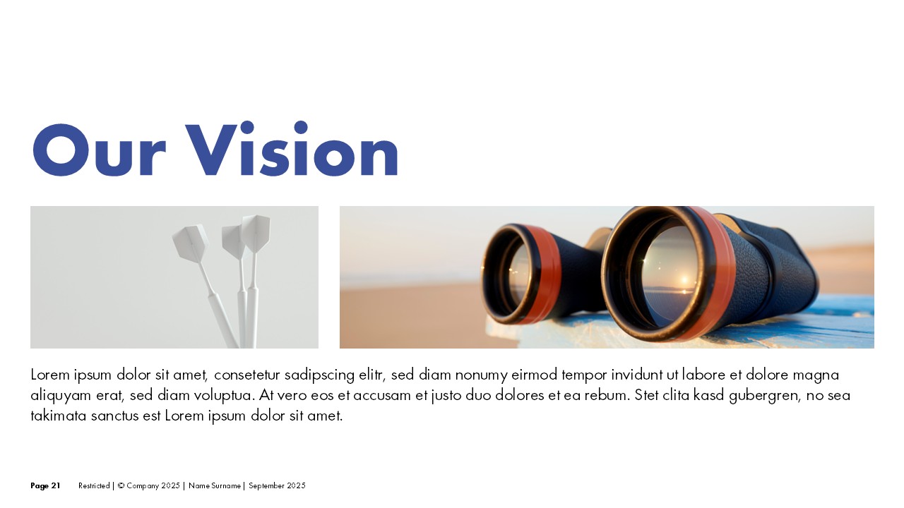
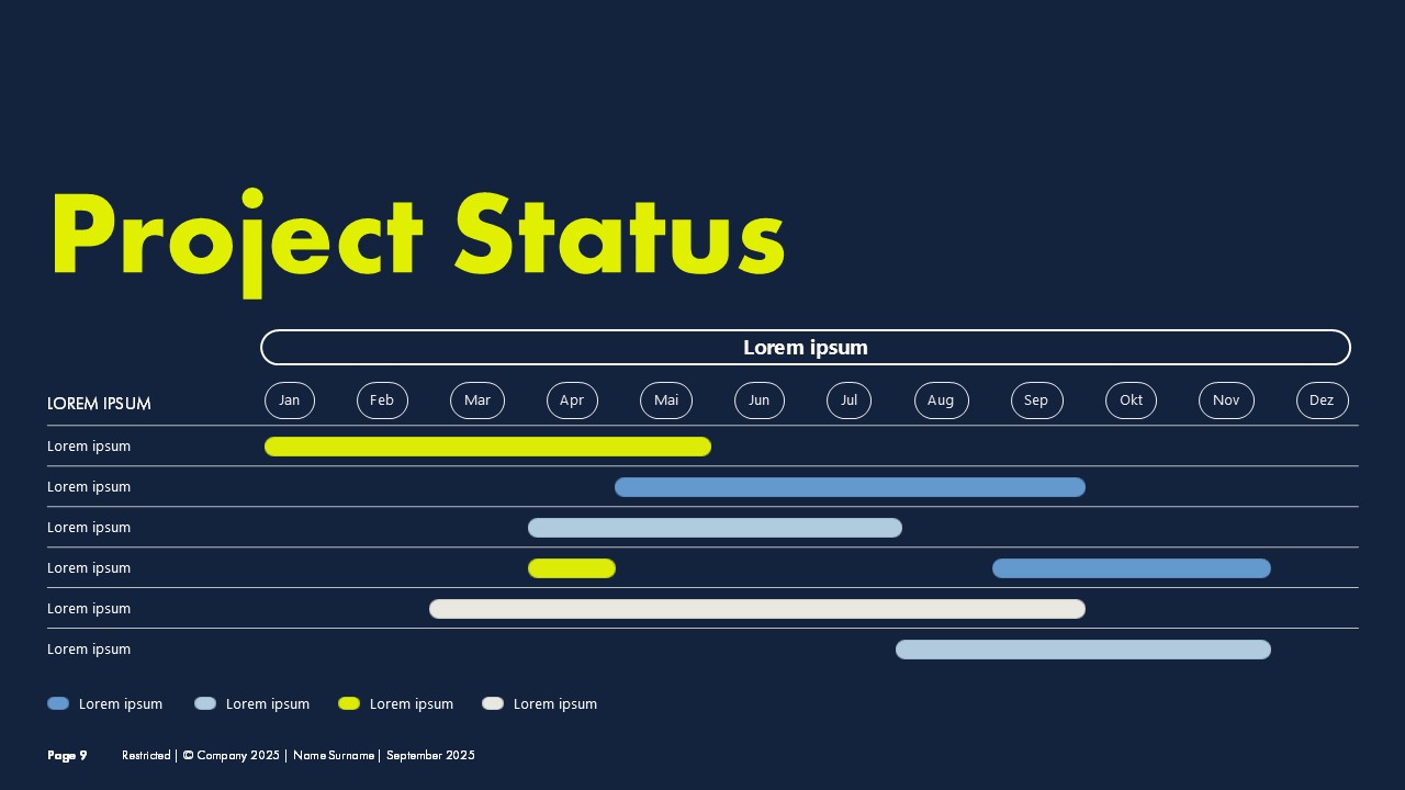
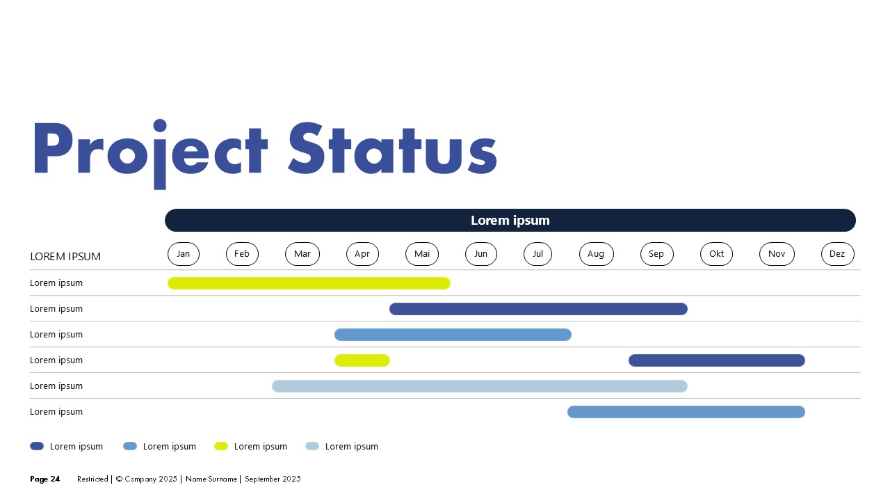
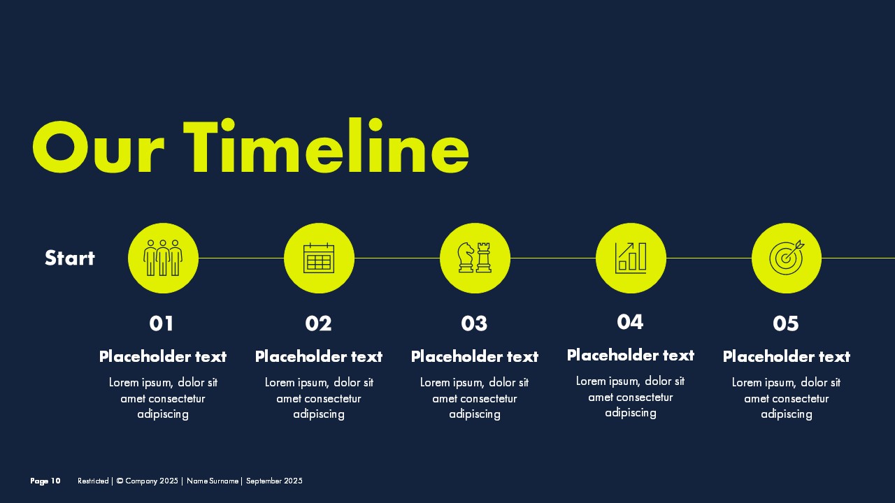
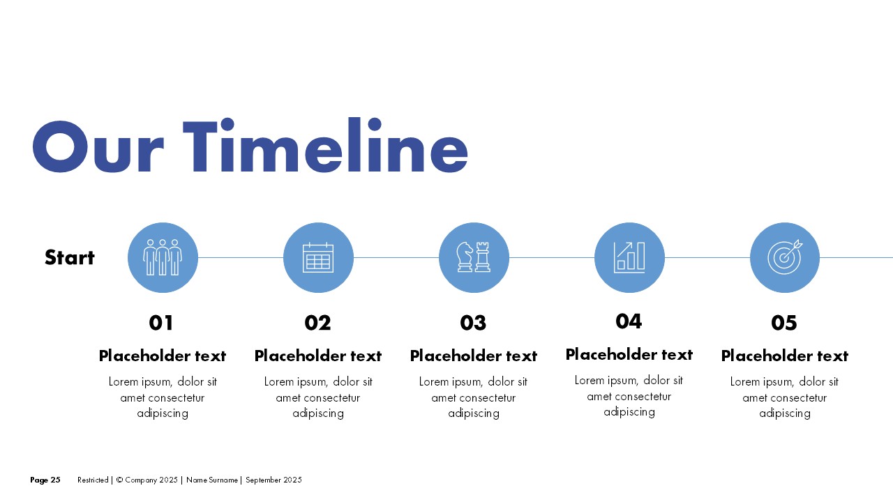
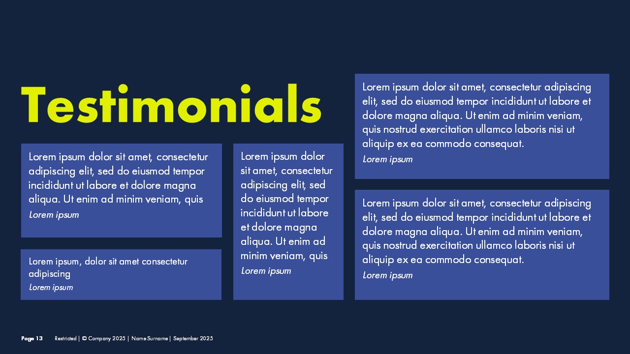
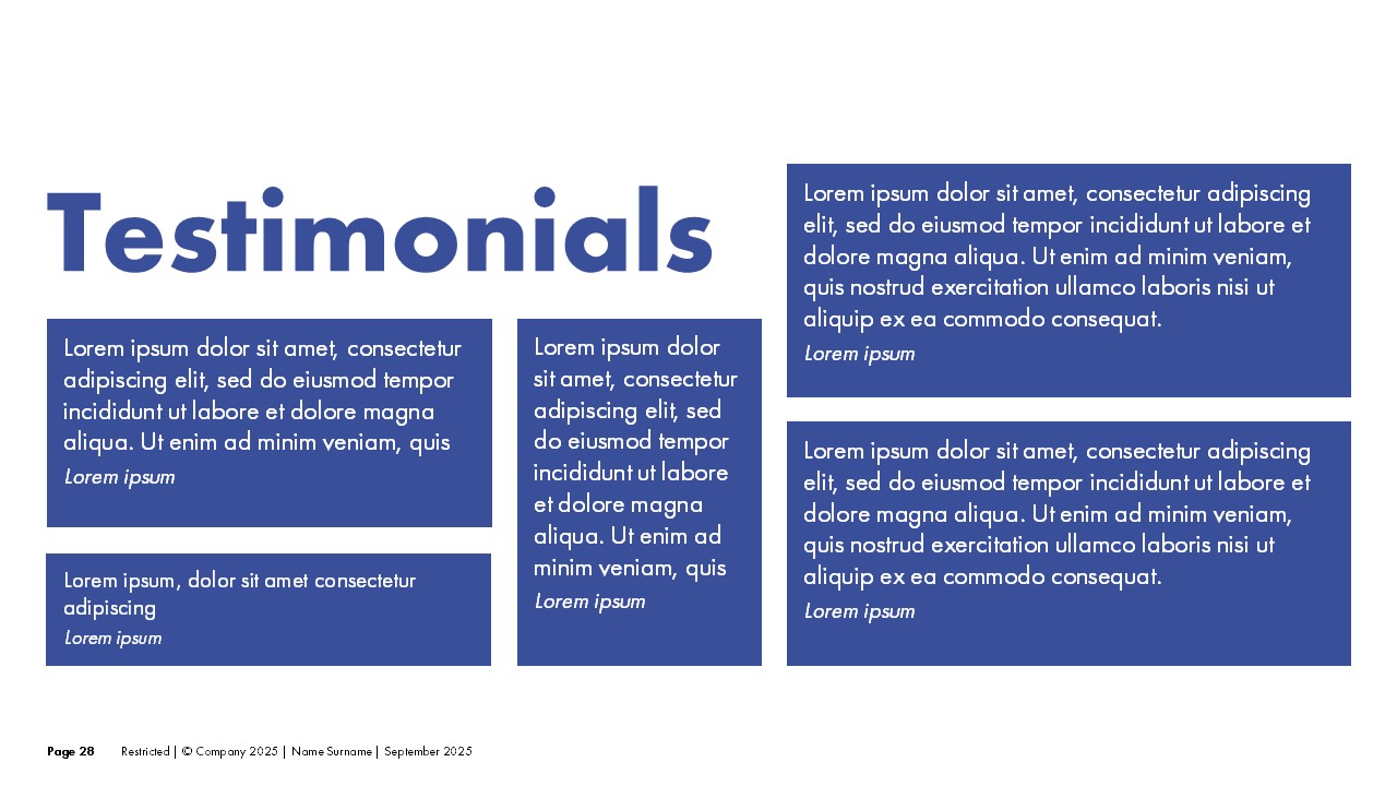
I balanced contemporary design trends with classic corporate sensibilities. The deck was designed in two versions: a dark background for high-impact presentations and a light background for more formal or printed contexts. Both versions share the same layout system, typography, and visual language, and in both cases the client's brand colors were used intentionally, adapted to each background to maintain visual impact and consistency throughout the deck, so the client can switch between them without losing brand identity. Clean lines, modern type, and a carefully structured flow keep the focus on the content.
The Result
A complete corporate deck that works across different contexts and audiences. The two-version approach gives the client full flexibility without the need for two separate design projects. Both versions are shown side by side below.